Thursday, 10 February 2011

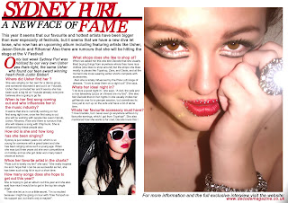
final double page spread


I decided to use two images for my double page spread, one blew up big and a smaller one on the other page, the reasoning for having one of the images blown up big is because i want my audiences eye to automatically be attracted to the model and her glossy image; by then seeing this it will capture their attention and make them look at the text.

The colours have remained fitting in with my contents page and front cover to show it’s a house style colour for my magazine "decode".
Colours are important in my magazine in particular because the colours portray my target audience in a way, having this deep but bright pink i feel aims at this girly, glossy teen sort of audience. So the colours of my text relate to my image as they are "glossy". The font i decided to use is a simple, easy-to-read font, this way its better for the audience also on double page spread the magazine conventions tend to be clear and easy to understand so that the audience will want to read it.

The language i have used for my double page spread is a very informal and chatty register, this is to maintain the audience’s attention as it is personal to their social groups dialect and the way i got around doing this was through my research. "Pixie Lott is totally my fav!", this is typically a girly teenage language, and when writing for magazines you have to be able to change the way you write to suit the audience. If this was for a older generation it would probably be worded something like "...... i believe is the greatest artist from that year" and where the "....." is would be replaced with someone like Whitney Houston as an older generation wouldn't be interested in a young teen artist like Pixie Lott. My double page spread has an opening paragraph as "this year it seems that our favourite and hottest artists" straight away in this opening it gets you hooked because of the word "seems " this indicates that there is a change about to follow, and the words used "hottest" straight away allows you to see what type of audience it is for.

If i could have improved my double page spread i would tried to come up with a more catchy glossy title, also i would have added in so much more chatty language when the questions were answered not only this but in the questions also.

final contents page

By playing around and experimenting with different layouts for my final contents page i managed to create a final contents page that i liked and felt matched my front cover well, i managed to do this by having a certain layout that i established from playing around with the other contents shown on my blog. I have kept to two main colours for the contents page, this helps to work with the conventions of a magazine, by having several various images i think worked well as people want to see thats going on in the magazine and in my research i saw this. The representations of the images i have used show this glossy type of look that i want my magazine to achieve.

The colours used are quite bright and match my front cover and double page spread
, this is a convention of magazines that i also noticed. My fonts are bold and eye-catching this helps to make the magazine look better and makes it more appealing for my teenage audience.

If i was to do it again and improve it i would have probably made my text a little smaller to advertise more headlines and pages that are in my magazine, by doing this it would have looked better i think.

However overall i think my contents page is quite good as i spent quite a lot of time rearranging and doing drafts, the research in addressing the audience helped me to establish what to put on my contents page and this way it would appeal for my targeted audience.

Friday, 4 February 2011

contents i started/made and didn't like


by making these and not liking them it helped me to notice room for improvement and i was able to put in better conventions of a magazine, also arrange things different and change colours to look more proffessional.

some photos i took for my three final products


my final front cover

I decided to use this image as my front cover image as it is only showing half of the face and this is challenging the conventions of a magazine, also its a bold and bright image which is the look i wanted my magazine to have (so it's eye-catching). I chose my title colour the same as my models lip colour so it reflects on the cover with a few other bits of text i put in the same colour, i also used it because its really bright and it stands out. I decided upon three main colours which is sticking to the conventions of a magazine.

The fonts i chose stand out well and contrast, by placing text on slightly rotated rectangles makes the text stand out and clearer to read for the audience. I have included the usual conventions of a magazine such as the date, price, bar codes, one main image and text to display whats inside (this is what attracts the audience as well as the image).

Because I decided upon my media products audience being fans of pop and also R&B music i had to give the cover a bit of both, so to achieve this look i didn't involve completely big,bold and bright colours and texts, i added in these dark boxes to frame the text which slightly takes it away from being a pop look, the font i have chosen does this as well because it is a big rough edged but then i contrasted it with a girly colour and added in another font which is more glossy looking. My image takes it away from being pop slightly as a pop image would be smiley and wearing bright girly clothes but because i have included bright make up and a glamorous looking model it makes it look slightly pop.

Evaluation: development of skills and understanding

By doing the preliminary task helped me a lot to understand Photoshop and how it works. By getting the change to do the preliminary task “college magazine” it helped me with how to use the tools on Photoshop it also allowed me to get used to playing around with effects so I got the benefit of being able to create my final three products. I learnt that in order to create a successful magazine you do need to do your research, by researching conventions of a college magazine and making questionnaires to ask my audience what they wanted to see on a college magazine helping me a lot with improving my preliminary task, so I developed these skills and done the same with the main task (creating a music magazine). The research I done also helped me to be able to analyse my magazine and other existing products. I also found that by doing research on other magazine this helped me to create and improve upon mine by looking at the conventions of certain magazines and including certain things into mine, the research also helped me to see how magazines should look and what content they should have.

The audience research I done was really helpful as well; by doing this it allowed me to be able to decide upon the colour, contents, style and genre of music of my magazine which helped me with each final product in a way. It also allowed be to be clear upon by target audience and by knowing this information I found ways to include it into my magazine to make it more appealing for the set audience.

Thursday, 3 February 2011

Evaluation: Technologies

From doing this media project I have learnt about new technologies that are used to create media such as a magazine, also I have learnt about enhancing appearances (done by technology) to make media products look more eye-catching and successful. I have developed an understanding of how to use Photoshop, and how it can be used to manipulate images, alter them, and make things that are there disappear.

While I took photographs for my magazine I learnt the importance of good lighting, space and plain backgrounds for a more professional look and also involving different clothes and colours/make-up as the picture could connote different things. For example having dark lighting and dark make-up creates a dull, cold, horror sort of look whereas bright colours, white backgrounds and good lighting create a happy looking photo. Backgrounds are really important when taking a photo, although you can usually rub things out on Photoshop having the right background is important as it gives the audience imagery and backgrounds are used to create the mise-en-scene.

On my images I chose to put a sheet up to have a plain, white background as this connotes glamour and wealth and creates this glossy impression which is what I wanted to achieve, also I used Photoshop to edit my photos and add layers to improve my models skin texture to make it look more of a professional photograph, also on some of my images a digitally hand coloured to change eye or lip colours. I thought that my front cover needed a little brightening to make it stand out and look bolder so I decided to slightly increase the brightness and the contrast just to make it a little more eye-catching for the audience.